Something weird washed up.
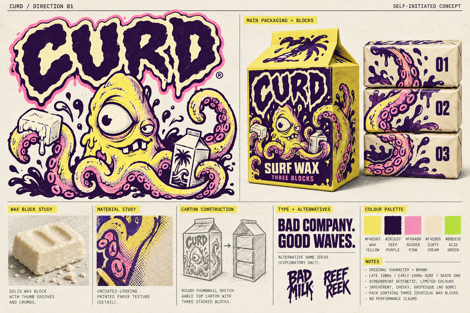
Rob selected REEF REEK, cheeky grotesque, and wax yellow + deep purple + hot pink with acid-green accents. REEF REEK is now the sole selected name. Earlier naming studies are archived history, not active backups. The lettering and mascot still need production refinement.
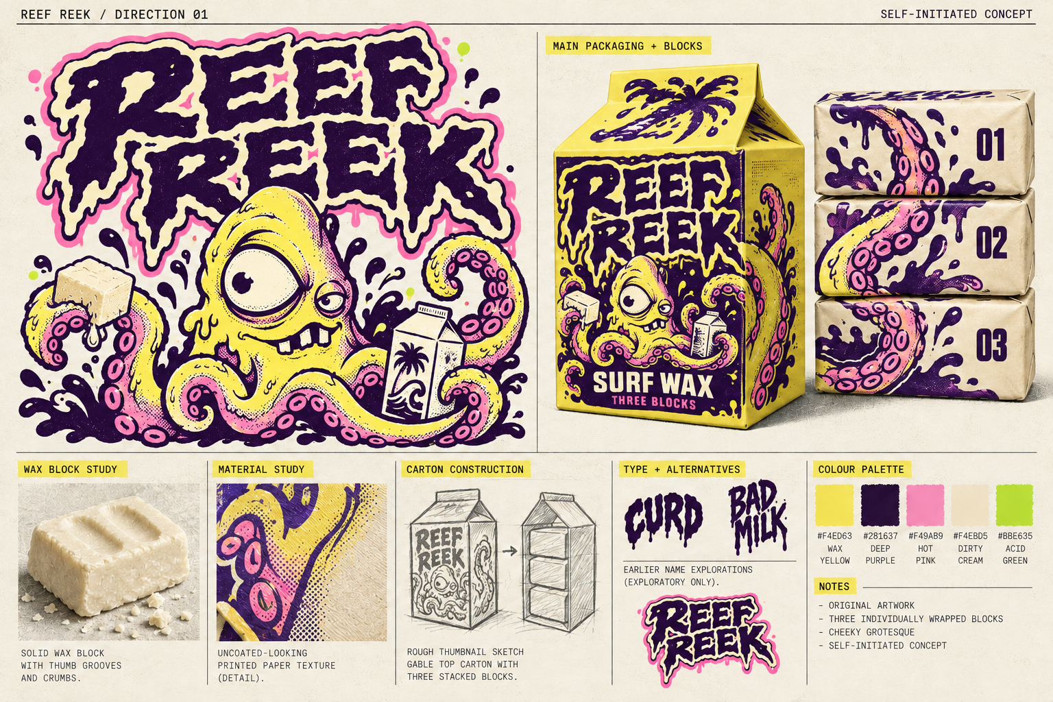
AI-generated direction artwork. The package and wax imagery are concept visualisations, not Blender renders or manufactured samples. Open full-size mood board.
Why REEF REEK
The repeated R sounds give it a shoutable, sticker-sized identity. “Reef” establishes the world; “reek” supplies the rude joke. The two equal-length words create a compact stacked mark that fits both carton and wax wrapper.
The creature
A lopsided kraken with one overgrown eye, one suspicious eye, two uneven teeth, and pink suction cups. It should look like a troublesome surf mate. Tentacles hold the carton, pull paper, and point through the page. Slime belongs to the creature’s illustration; the wax is shown as a solid.
Loud ink. Solid wax.
Yellow reads as wax and sun; purple supplies an inky ocean depth and strong reading contrast. Pink gives the creature a fleshy, ridiculous quality. Cream creates quieter space for captions and process. Green is reserved for small signals and surprising details. Body copy uses purple on a light field; light colours are not paired with each other for small text.
Typography
Mark: custom, two-line REEF REEK lettering with blunt angular skeletons, irregular sea-eroded edges, a cream keyline and a small pink offset. Refine the generated lettering into clean original vector outlines before production.
Headlines: a heavy condensed grotesque, tightly spaced and upright enough to read while moving. Body: a plain, open sans serif. Annotations: a restrained mono face for the sketchbook feeling. The final licensed font files are not selected or installed yet; this review uses Arial and system monospace.
ONE SEA FREAK.VOICE: short, dry, mischievous.
Selected hero line: “Three blocks. One sea freak.”
Supporting voice: “Questionable company.” / “Let the weirdo out.” / “Back to the surface.”
No invented performance, scent, temperature or environmental claims.
Reference rationale
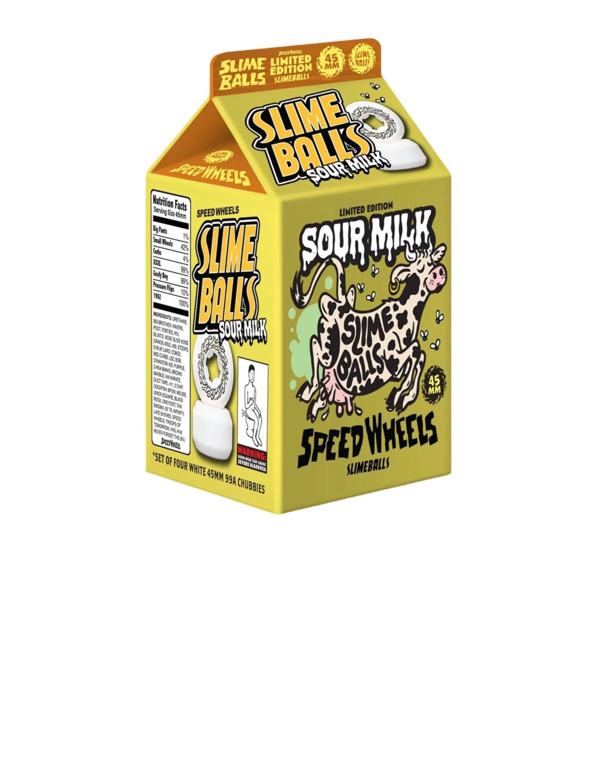
The supplied Sour Milk carton contributes principles: extreme type scale, thick outlines, acid contrast, a grotesque mascot, and the familiar grocery package used for an unexpected object. The broader late-80s/early-90s surf and skate references in the brief contribute sticker-like silhouettes, limited-ink graphics and irreverence.
REEF REEK changes the subject, palette, wordmark construction and panel hierarchy. The creature wraps around the carton; the wrappers complete a tentacle triptych. Keep the source cow, badges, nutrition parody, branded lettering and existing label arrangement out of the identity.
A carton with three residents.
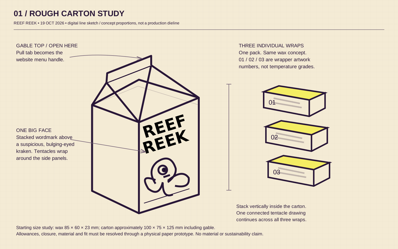
Editable digital line sketch made before website implementation. Dimensions are a starting proportion study. Open SVG.
Carton
Compact gable top. Purple front panel, yellow sides, a large stacked mark and one dominant creature. A tentacle continues around the corner. Small copy stays on the quieter side panel.
Wrappers
Exactly three separate wrapped blocks, numbered 01–03. Three crops of a single tentacle composition align when stacked. The numbers identify artwork, not different formulas or temperatures.
Physical study
Begin with a paper mockup to check fit and opening. Proposed wax dimensions: 85 × 60 × 23 mm; carton approximately 100 × 75 × 125 mm including gable. Construction, tolerances and materials remain to be validated.
Open. Unwrap. Leave a trail.
The tape-pull rhythm becomes a causal wax sequence: the carton opens, one wrapper peels away, and the solid block rubs down a board, leaving a chalky trail. This carries the eye through the page without suggesting that surf wax stretches into a tape-like ribbon.
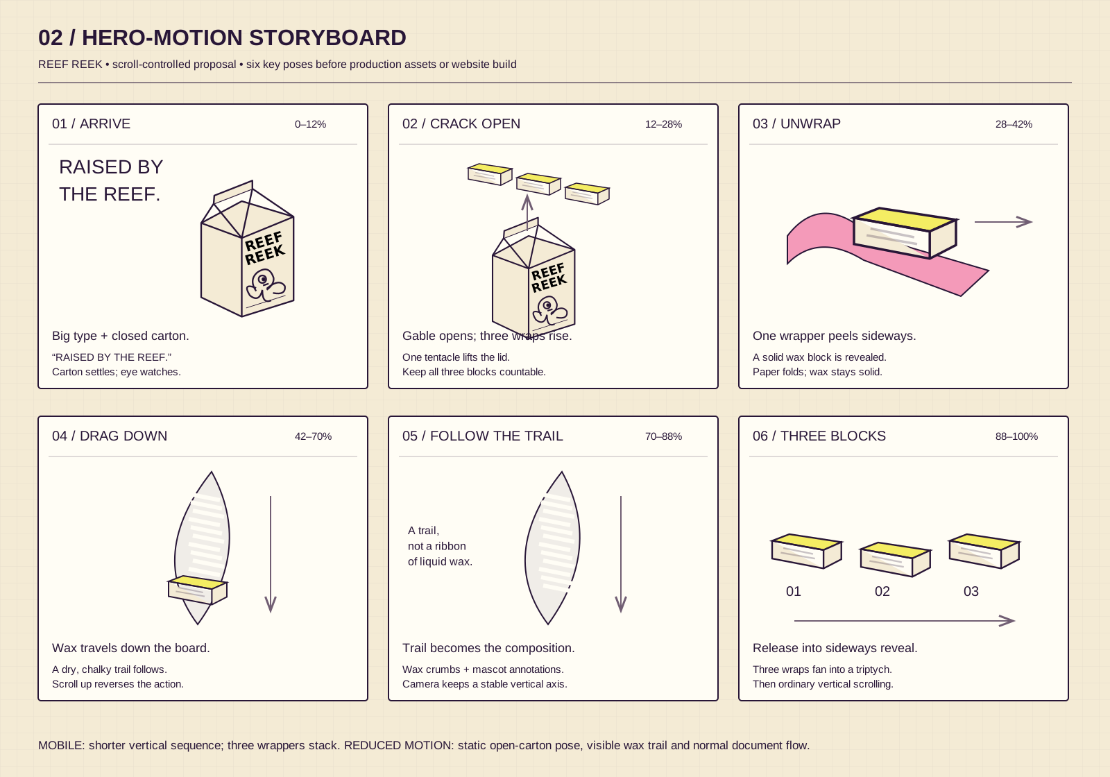
Proposed scroll percentages are relative to the hero scene, not measured timings from Sweet Tape. Open SVG.
Desktop proposal: roughly 2.2–2.8 viewport heights of scroll for the hero. Stable camera, gentle product turn, scroll-scrubbed opening and wax trail. A short three-panel horizontal passage follows later.
| Moment | REEF REEK action | Timing / control proposal |
|---|---|---|
| Text response | Letters nudge and rotate as if a tentacle pushes from behind. A pink edge briefly appears. Preserve readable word shape. | 160–220 ms response; short spring settle. Only on fine pointers; keyboard focus uses a clear static state. |
| Menu | “CRACK OPEN” carton tab opens a paper-panel navigation with same-page anchors. | 420–550 ms unfolding. Click and keyboard work; dragging is optional. Escape closes and returns focus. |
| Material pull | Carton → wrapped block → exposed wax → wax trail. | Scroll controls progress and reverses it. A visible “Skip animation” link jumps past the sequence. |
| Horizontal passage | 01 / 02 / 03 wrappers align into the creature’s tentacle illustration. | One short desktop passage, around 2.4–3 viewport heights of scroll. Progress indicator plus Next/Previous buttons. Vertical cards on phones. |
| Footer play | Drag wax wrappers and creature stickers around a tide-pool stage; “Restack” restores them. | Decorative only. Permanent ordinary links remain outside the play area. Static arrangement with reduced motion. |
Sweet Tape, closely observed.
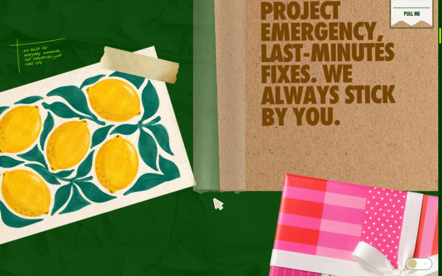
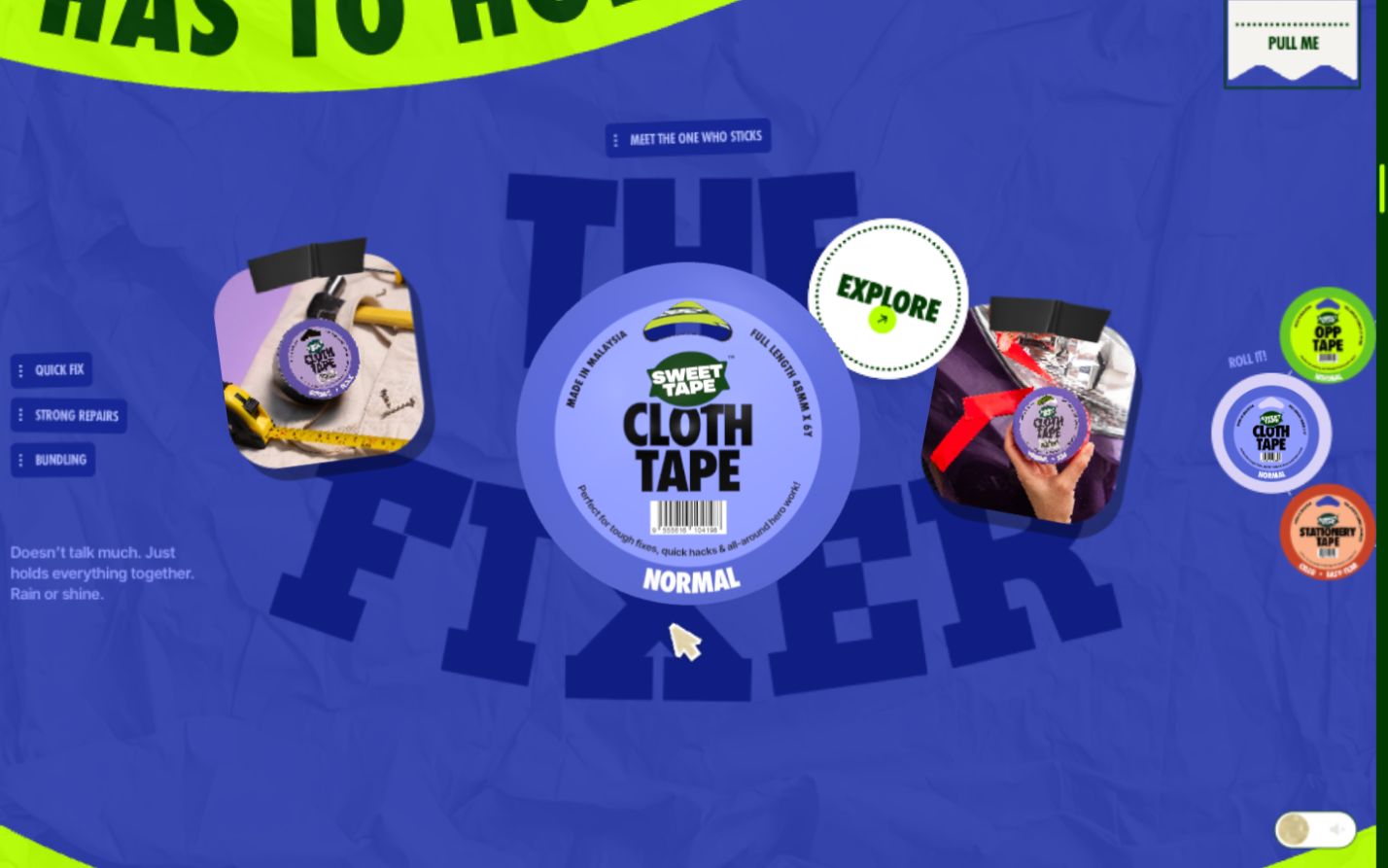
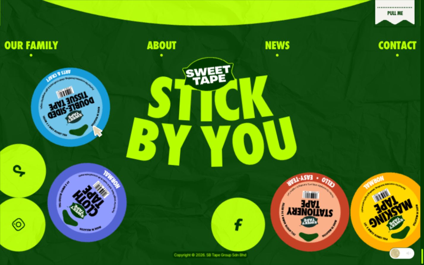
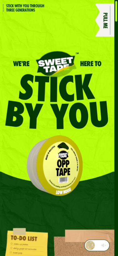
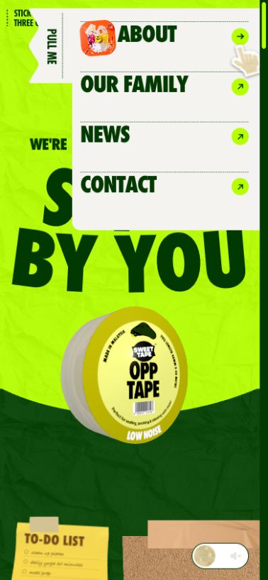
Sweet Tape homepage inspected on 19 October 2026 in the in-app browser at 1440 × 900 and 390 × 844 CSS pixels. Also sampled the initial 911-pixel layout. The mobile run is a responsive viewport test with desktop pointer input, not a physical phone/touch or Safari test. Screenshots preserve specific observed states; some capture motion in progress.
Computed styles confirmed the declared font families. At the initial 911-pixel width the hero h1 was about 185.5 px, weight 800; at 390 pixels it was 124.8 px. Letter transforms further affect apparent size. Fonts and sizes describe the reference site, not the REEF REEK implementation.
| Feature | Observed desktop behaviour | Observed mobile behaviour | REEF REEK translation |
|---|---|---|---|
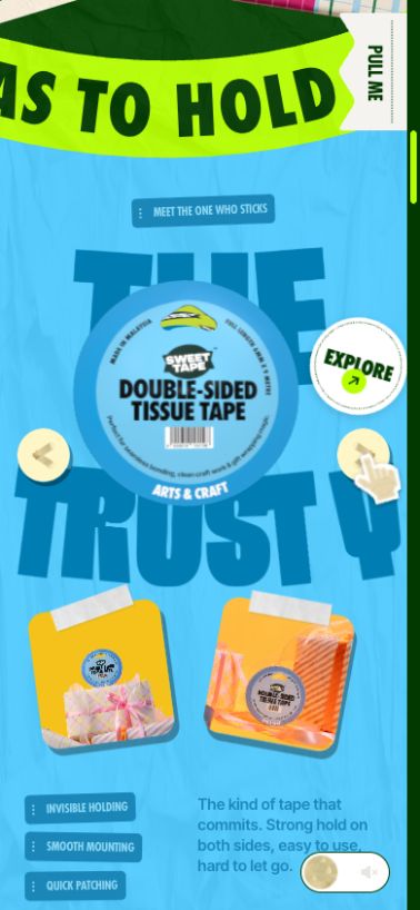
| Palette & surface | Electric yellow-green, dark forest green, crumpled-paper texture. Colour changes with product selection; masking orange and cloth blue/purple were inspected. Kraft, off-white and bright photo accents. | Same texture and colour logic, including blue when Next selected double-sided tape. | Wax yellow / purple as the stable pair; pink creature details. Dry rub marks and print grain supply texture. |
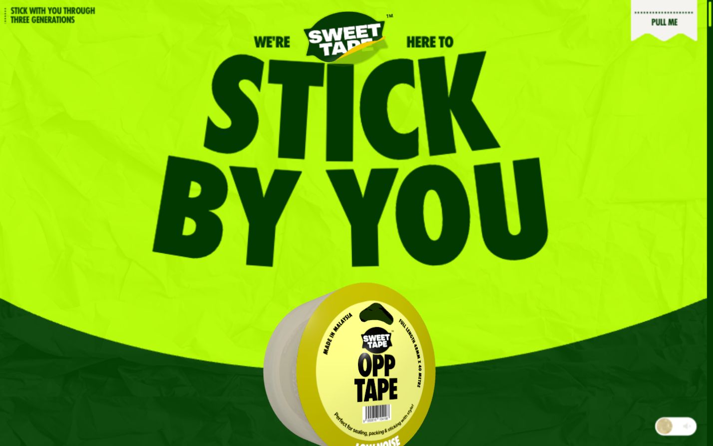
| Hero | Oversized two-line slogan, small supporting words, logo between them, floating tape roll straddling a curved section boundary. Menu and sound controls remain fixed. | Slogan and roll fit a narrow column, with a large top breathing space. Menu handle rotates vertically along the right edge. | Own stacked brand and short headline, central carton, a drawn shoreline boundary. Essential controls stay clear of the art. |
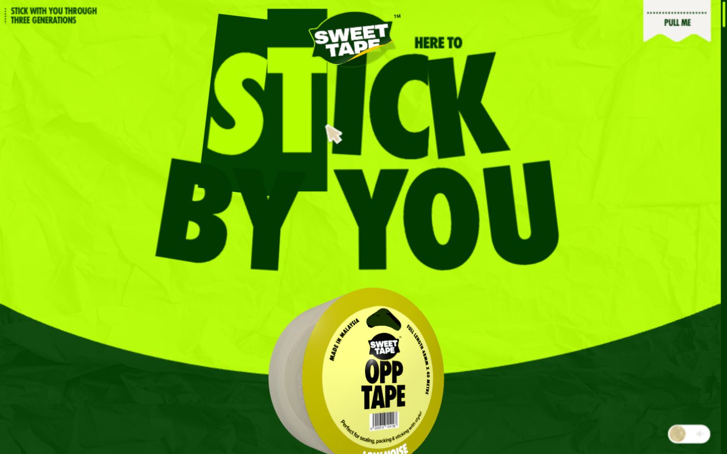
| Text hovers | Pointer sweep across the hero made individual letters enlarge, rotate and reverse colour within dark rectangular patches. The surrounding letters recompose. | Responsive rendering inspected; genuine touch hover behaviour was not tested. | Smaller nudges and pink offsets; no information or links available only on hover. Static readable letters on touch. |
| Tape-pull scroll | Roll turns from label-facing to side-on; a long translucent strip extends down through the craft collage. Background objects and copy enter at different rates. | Roll and central strip remain; collage narrows. The long kraft-panel slogan was absent from the mobile accessibility tree and visually blank in the sampled view. | Carton opens then wax travels downward, drawing a dry trail across a board. Keep essential copy in the document flow. |
| Collage & divider | Taped note, artwork, kraft panel and gift-box crops surround the material trail. A curved lime slogan band moves across the transition. | Collage crops are tighter and taller; the scrolling band remains. | Original tide notes, wrapper studies and board marks. A tentacle-shaped divider can guide the eye; avoid reusing taped craft-photo compositions. |
| Product family | Central package, large product-personality title, use labels and two photos. A curved wheel of six labelled choices changes the whole colour/content scene. Cloth selection changed “The Creative” to “The Fixer.” | Visible Previous/Next buttons replace the wheel. Next changed to double-sided tape and the scene became blue; photos and supporting text sit below. | Explore carton, wrapper and solid wax as three views of one concept. Do not invent six products, claims or formulas. |
| Horizontal story | Vertical scroll moves a pinned oversized canvas sideways through “To Create,” “To Fix,” and “To Protect,” with diagonal shifts between rows, product cutouts, photo cards, arrows and handwritten notes. | The horizontal/diagonal journey remains. Giant cropped letters and some sparse intervals take substantial scroll distance; the narrow view shows fragments at a time. | A shorter desktop triptych of the three wraps. Mobile uses a complete vertical stack, preserving sequence and legibility. |
| Closing panel | A photo of an armful of tape sits beside a dark rounded slogan panel, with a connecting tape detail. | Photo and slogan panel stack vertically. | Open carton with three blocks, paired with the kraken’s final line. Link to the process section and robcape.me. |
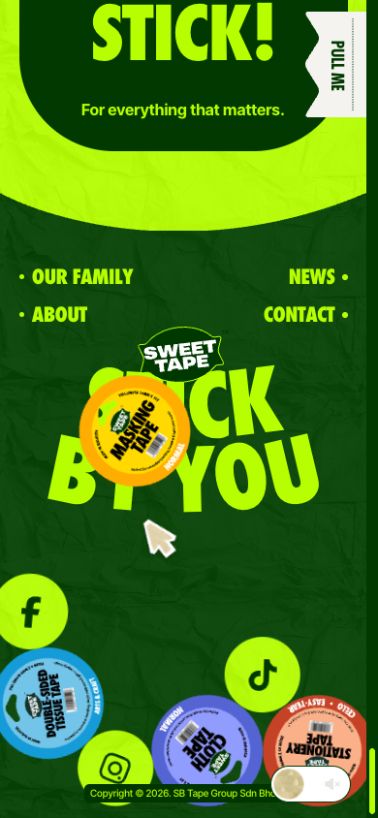
| Footer | Repeated navigation, giant brand slogan and moving tape/social tokens. Dragging an object changed its position and the surrounding pile. | Navigation becomes two columns; smaller tokens remain draggable in the viewport test. | Wrapper and sticker play area with a Restack button. Keep portfolio and section links stable, focusable and separate. |
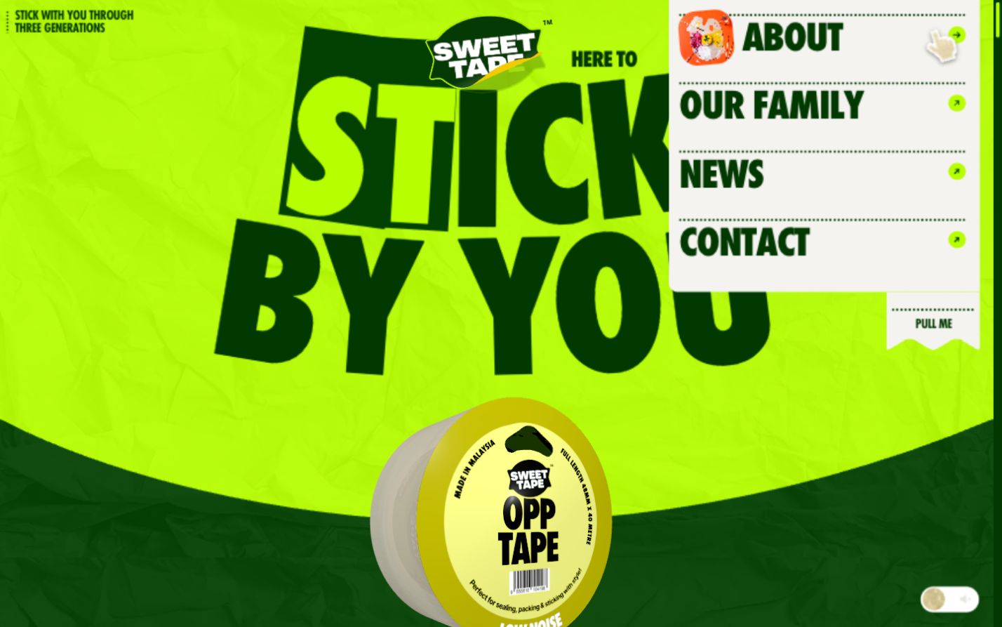
| Pull-down menu | Top-right paper tab reveals a light vertical panel with four large links, perforation-style dividers, arrows and a hover thumbnail. Escape closes; focus remains on the trigger. | Vertical side tab brings the panel inward from the right. The same links fit a narrow white panel. | Carton fold with four anchors: The Carton / The Wax / The Creature / The Making. One-page navigation. |
Measured palette and implementation evidence
Computed reference colours include dark text rgb(1,57,0) / #013900, body background rgb(3,65,2) / #034102, and acid green rgb(182,254,0) / #B6FE00 on the skip link. Orange, kraft and blue are visually observed scene colours; exact values were not exhaustively sampled.
The live page includes /_next/static/ resources and a Turbopack-named script, supporting a Next.js build inference. Adobe Typekit CSS is linked. This study did not establish versions, the animation library, a 3D engine, physics library, CMS or original design tools. No claim is made that Sweet Tape uses Blender or GSAP.
Saved DOM/CSS observations. The supplied Awwwards URL was attempted via the web reader but was unavailable; award status and creator credits are not asserted.
Reduced motion and accessibility
The live page exposes a Skip to content link, a named menu button with expanded/collapsed state, a labelled sound control initially off, named product controls, and heading labels that group split animated letters. Escape dismissal was tested successfully. The product controls appear as checkboxes in the desktop accessibility tree; this is observed semantics, not a recommendation for our selector.
Readable CSS contains reduced-motion rules disabling character transforms, removing some transitions and preload motion, setting the giant canvas to a static vertical column, and hiding decorative props and diagonal arrows. The operating-system preference was not changed or emulated, and JavaScript animation fallback was not verified. This is a design study, not a WCAG conformance audit.
- Respect
prefers-reduced-motionfrom first paint and offer a visible Motion on/off control. Use one static open-carton image and a normal vertical document when motion is off. - Every action works by keyboard and touch. Menu has an accessible name, expanded state, Escape dismissal and focus return. A drag gesture is never required.
- Keep complete headings available to assistive technology while decorative letter duplicates are hidden. Essential text is HTML, not baked into animation frames.
- Use a minimum 44 × 44 CSS-pixel design target for controls, clear focus rings, body-text contrast of at least 4.5:1, and test 200% zoom plus 320-pixel reflow.
- Sound stays optional and off by default. Pause automatic movement; make the footer play area optional. Provide static ordinary links outside it.
- Test the actual page on iOS Safari and Android Chrome after implementation. Confirm the canvas fallback, slow loading, resize, back navigation and reduced-motion mode.
The choice to disable non-essential interaction motion follows W3C’s guidance on animation from interactions. Its specific criterion is Level AAA; this document does not claim compliance.
The making is part of the work.
The brand website stays on one page. The “Making” section provides a concise case-study entry point; the fuller robcape.me case study can explain the work when it is completed. No shop, checkout, product certification, fabricated client or invented results are needed.
| Status | Tools / assets | What can accurately be claimed |
|---|---|---|
| Used this round | Built-in image generation; direct browser inspection and read-only DOM/CSS measurements; Python-authored SVG diagrams; HTML/CSS and a small JavaScript mode switch for this review document. | AI-assisted concept exploration, original art direction, responsive reference study, rough packaging sketch and motion storyboard. |
| Proposed website | Semantic HTML, CSS, vanilla JavaScript modules; GSAP + ScrollTrigger for coordinated scroll scenes; SVG masks for wax trails; optimised Blender image sequence or stills. | Proposed production stack. A separate HTML/CSS/vanilla-JavaScript prototype has since been created; GSAP and Blender remain planned. |
| Proposed 3D pipeline | Blender carton model with folded gable, three wax blocks, three wrapper meshes, UV artwork, paper/wax material studies, lighting tests and rendered hero poses. | Not yet produced. The current mood board must never be captioned as a Blender render. |
| Optional later experiment | Higgsfield for a separately labelled creature interlude or promotional loop if it adds something the designed scene cannot. | Not used this round. Keep generated video provenance separate from Blender animation. |
- Refine the identity. Redraw the chosen wordmark and mascot; establish front, side and wrapper artwork. Preserve dated explorations as process history; develop REEF REEK only.
- Test the object. Make a paper carton and three dummy blocks; photograph closure, fit and scale. Record actual measurements.
- Build Blender assets. Save model versions, UVs and material tests. Compare soft daylight, hard graphic key light and coloured rim light. Export clay and final views from the same camera.
- Prototype the hero. Use the six storyboard poses first. Validate the wax trail and scroll length, then refine frames. Profile image memory before committing to a long sequence.
- Build the one-page experience. Implement ordinary HTML content and reduced-motion flow first; add the coordinated desktop scenes and touch controls.
- Document outcomes honestly. Record actual library versions, render settings, asset sizes, tested browsers and any changes made after testing. Publish metrics only if measured.
Case-study narrative
Brief → naming choices → source interpretation → rough drawings → identity system → paper package → material/lighting experiments → motion storyboard → responsive implementation → testing and reflection.
Frame it as a self-initiated fictional brand for robcape.me, with Rob’s creative direction and AI assistance stated accurately. Separate tools used from tools proposed, and concept visuals from production assets.
Archive
Reference image, both name studies, rough SVG carton, six-frame storyboard, desktop/mobile screenshots and measured style observations are saved in the project. Reserved Blender/material/lighting/render folders are empty placeholders for the next production stage.